

Case Study · Brand Identity & Packaging
Branding Lancaster Cast Iron
Expanding a visual identity for a premium cookware company.
Some projects are purely professional. Others feel personal before the first brief is even written. Lancaster Cast Iron was the latter — a brand built by friends, rooted in craft, and deserving of a visual identity that could finally hold its own weight. The challenge wasn't creating something new. It was uncovering what was already there and giving it room to breathe.
Brand & Client Background
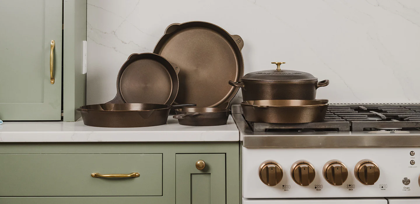
Lancaster Cast Iron is a small business based in Lancaster, PA, making American-made cookware that lives at the intersection of tradition and craft. Their products are designed for the home cook who takes their kitchen seriously — and for the professional chef who never stopped caring about where their tools come from.
Their mission says it best: they want people to feel more competent and confident in the kitchen, gathering around the table with the people they love. Everything they sell is made in America. That's not a footnote — it's the foundation.
They came to me at an inflection point. Their product was premium. Their brand hadn't caught up yet.
The Challenge
The logo was solid. But a logo alone isn't a brand — it's a starting point. Lancaster had no standards to draw from, no system to guide decisions, and packaging that undersold what was inside the box.
The original packaging was simple: kraft paper, black ink. Functional, but flat. It didn't communicate the quality of the product, the heritage of the craft, or the premium positioning they'd earned. As they prepared to expand their product line, they needed more than a refreshed look. They needed a foundation.
Our Approach
Discovery & Research
Because I knew the founders personally, I had a head start on understanding the brand's heart. The deeper work was translating that into a visual language — something that felt authentic to Lancaster's roots while standing confidently on a retail shelf.
The key tension to resolve: traditionally inspired, but premium. Too rustic and the brand feels generic. Too modern and it loses the soul that makes Lancaster worth caring about.
Concept Development
We worked closely throughout, collaborating on decisions rather than presenting finished work for approval. That back-and-forth made the outcomes sharper. The founders know their brand intimately, and having them in the room (figuratively and literally) kept the work grounded.
The Design
Brand Identity
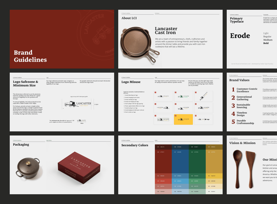
Color palette – The centerpiece of the expanded identity is a rich red/burgundy that immediately elevated the brand's presence. It felt authentic — a nod to warmth, hearth, and the table — without veering into cliché. It's the kind of color that earns its place.
Brand usage guidelines – Beyond color, I developed a full set of standards: how the logo lives in different contexts, spacing and scale rules, and guidance that would let Lancaster make confident design decisions long after this project wrapped.
Icon set – A new family of icons extended the brand vocabulary, giving the team flexible visual assets that maintained consistency across touchpoints.
Packaging
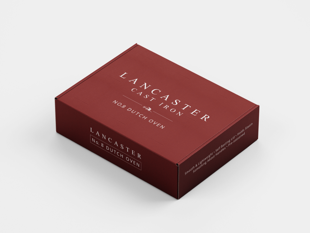
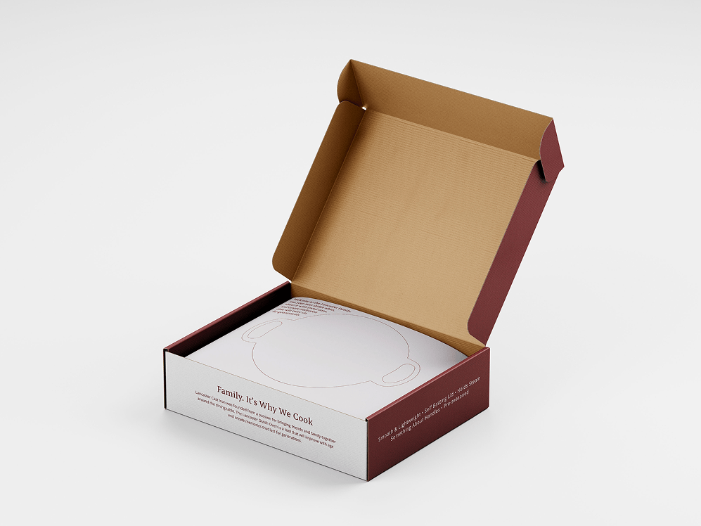
The packaging redesign was where the system came to life. The kraft-and-black baseline was replaced with a design that introduced color, hierarchy, and a clearer value proposition for each product. Standards were built to scale across multiple products and variations — so the system could grow as the line did.
Seeing each SKU feel distinct but unmistakably Lancaster was the goal. We got there.
Outcome & Impact
The client loved it. More than that, they were part of making it — which meant the final result felt like theirs, not just delivered to them.
The new packaging showed up in stores. And that moment — seeing something you designed on a shelf, doing its job — is its own kind of metric.
Reflection
Working with friends carries its own kind of pressure. You want to do right by them — not just professionally, but personally. What I found is that the closeness was an asset. It produced more honesty, more trust, and ultimately better work.
This project reminded me that a brand system isn't decoration. It's infrastructure. Lancaster didn't need a new logo — they needed the confidence to make decisions consistently. That's what the guidelines gave them. That's what the packaging proved.
The cast iron skillet your grandmother used didn't come with a brand story. It didn't need one — its presence spoke for itself. Good branding works the same way. It doesn't shout. It just makes it unmistakably clear that what's inside is worth your trust.
Credits
- Client
- Lancaster Cast Iron
- Creative Direction & Design
- Tyler