

Case Study · Brand Identity & Packaging
Brand Refresh & Packaging for Seedhouse Coffee
Positioning a specialty roaster for the next stage of growth.
New ownership. Real ambition. A brand that had good bones but hadn't been built out. The ask was focused: take what exists, make it shelf-ready, and leave room to keep growing.
Brand & Client Background
Seedhouse Coffee is a specialty roaster based in Steamboat Springs, Colorado. They roast small-batch, 100% organic coffee with a singular focus: presenting a distinct sense of place in every cup. Their beans ship nationwide, supply local cafés, and have earned a growing presence on regional grocery shelves.
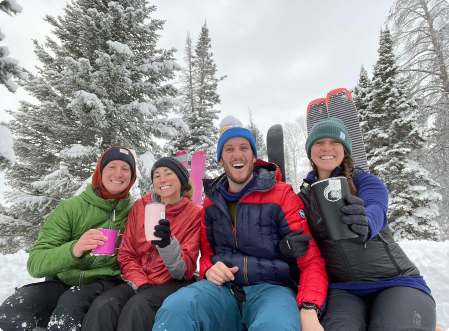
When friends of mine purchased the company, they came in with a clear vision and a specific near-term goal: move beyond being a beloved local roaster and grow into a brand that could hold its own in serious retail environments. That meant the packaging — their most visible touchpoint — had to do a lot more work.
The Challenge
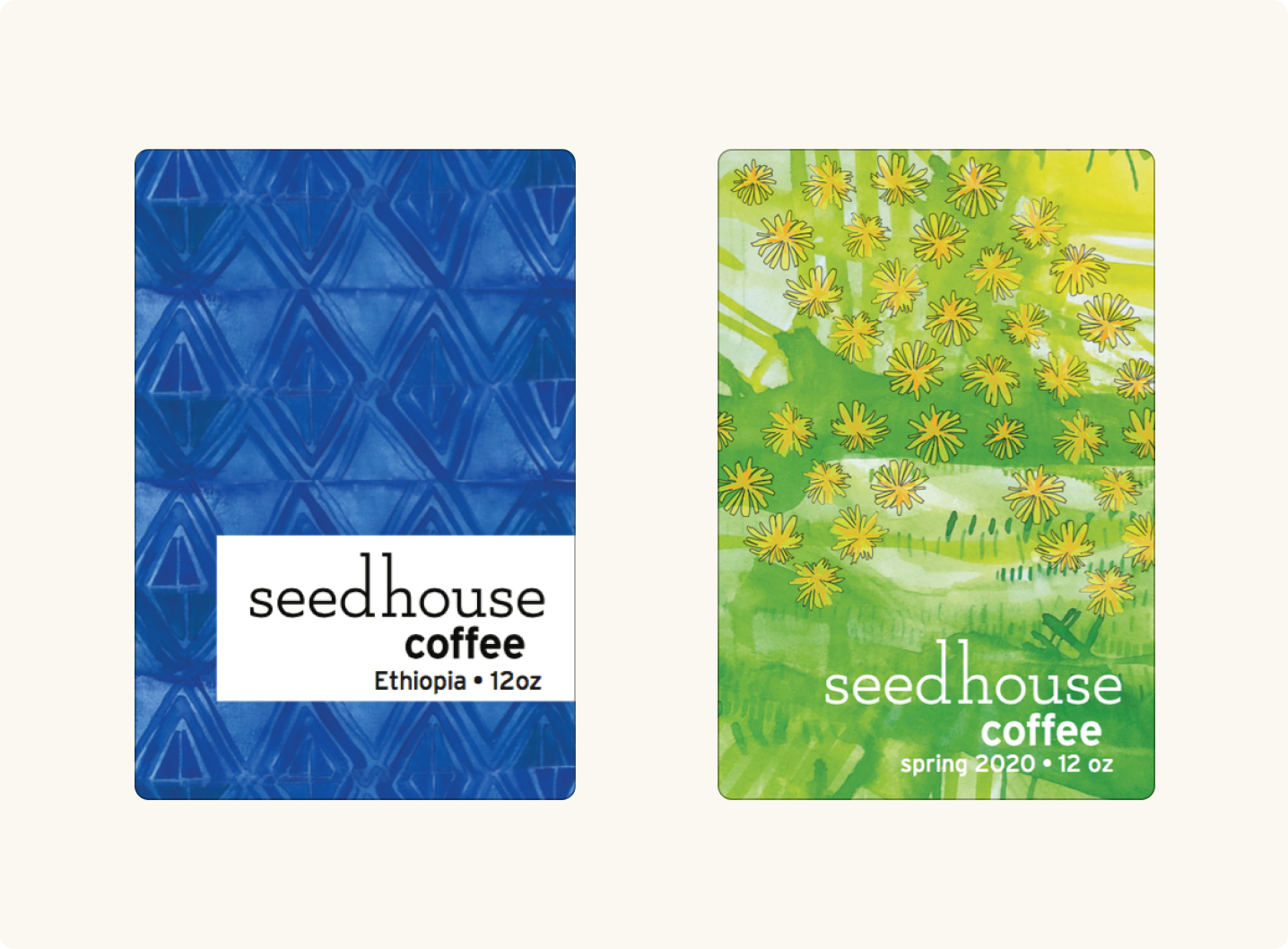
Seedhouse had a brand, just not a complete one. The bones were there, but the visual system lacked cohesion and the depth needed to compete on a grocery shelf. There were no established standards, no logo mark — just a wordmark doing all the heavy lifting across every product.
The ask was focused: take what exists, add meaningful design assets, and create packaging that could get them into grocers without leaving the next phase of growth stranded. This was a first step, not a final answer — and everyone knew it going in.
One more wrinkle: they were bootstrapping. The packaging solution had to work within a real constraint — generic kraft paper bags with a custom label. The challenge wasn't just design. It was making something simple feel premium.
The Work
A Logo Mark Rooted in Place
The wordmark was updated — modernized slightly in its typography while preserving the established layout and feel. But the bigger addition was a new logo mark: a small house shape overlaid with topographic lines pulled directly from the Seedhouse region near Steamboat.
The mark is visually abstract but deeply literal. The topo lines aren't decorative; they're a map. It's a small detail most people won't consciously register, but that's exactly the point. It belongs there.
The reference is specific. A "seedhouse" is a real type of structure in the area — a place where seeds were stored and protected for the next season.
Packaging That Could Grow
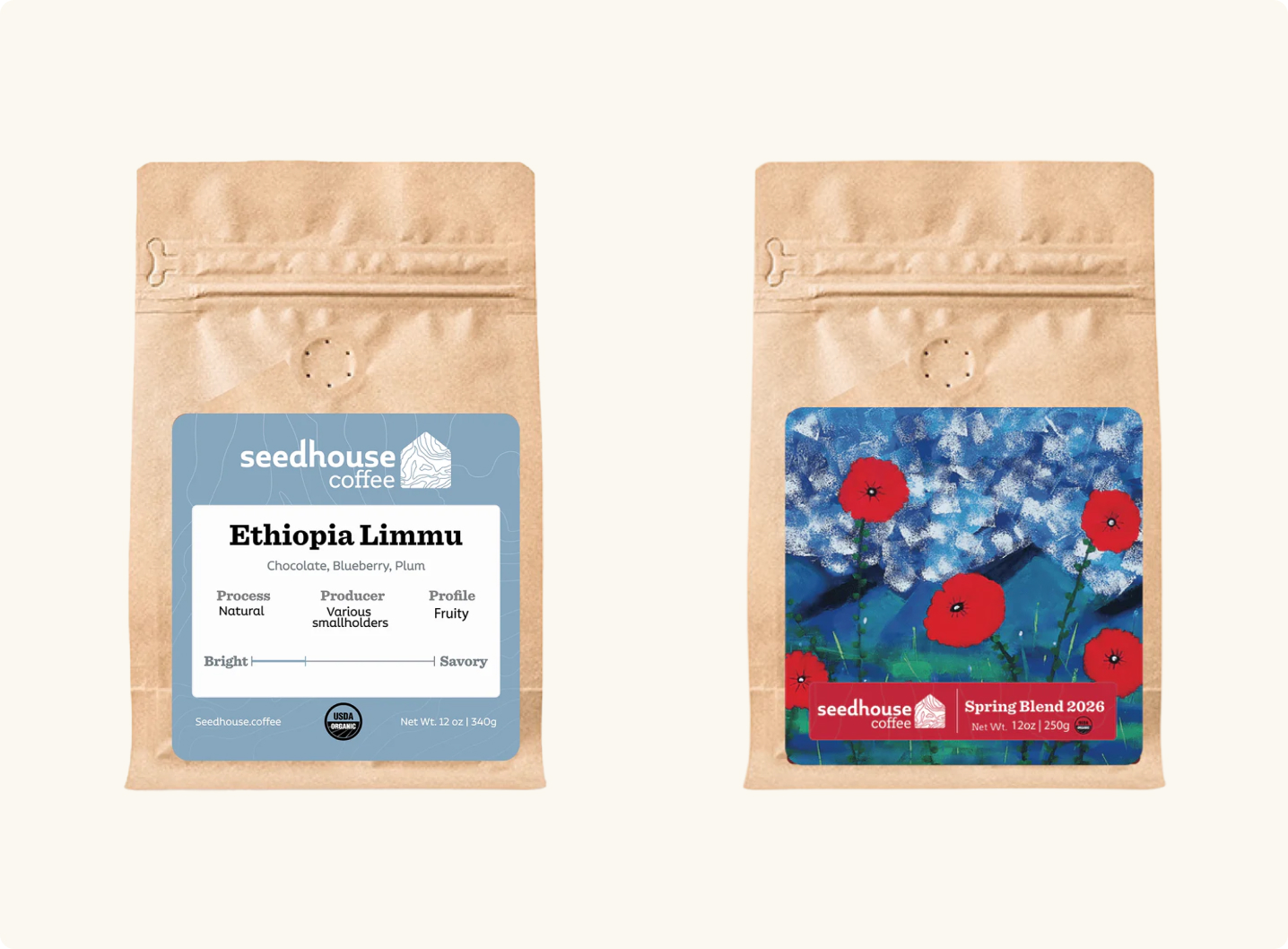
Every coffee label was redesigned from scratch. Essential consumer information — organic certifications, volume, tasting notes — was integrated cleanly into the layout. Each single-origin coffee received a distinct color tied to its flavor profile, giving the line a way to differentiate without fragmenting.
The seasonal blends presented a different kind of problem. Seedhouse sources local artwork for those labels, which meant the design system had to accommodate artwork it couldn't anticipate. I built a flexible template — a defined structure that could hold any piece of art while keeping the label family visually consistent bag to bag.
Outcome & Impact
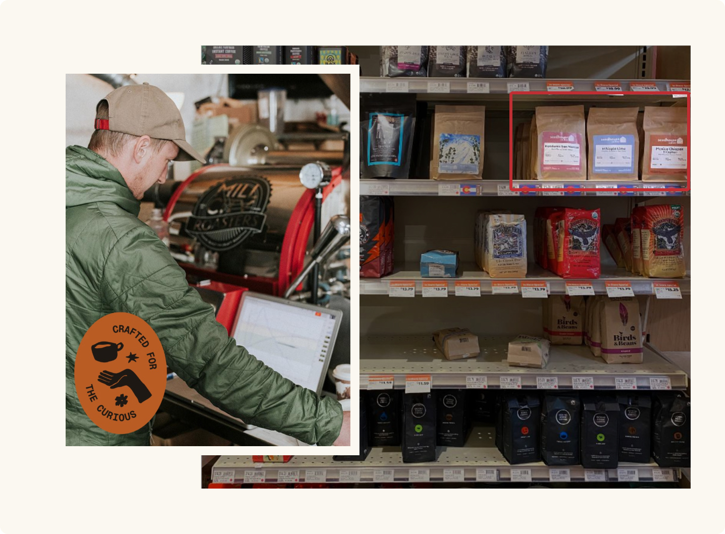
The first time I saw those bags on a grocery shelf next to the competition, it was clear the work had landed. They stood out — not by shouting, but by simply looking like they belonged somewhere more expensive than they were. That gap between perceived value and price point is where premium brands live.
More than the shelf presence, the goals got met. Since this work wrapped, Seedhouse has hit most of their growth targets and is now moving into custom-printed bags — the next tier of brand investment that wasn't possible when we started. The brief was always to usher them into their next chapter. That's what happened.
Reflection
There's something interesting about designing for constraint. The kraft bag was a limitation, but it was also clarifying — every decision on that label had to earn its place. No distraction, no filler. Just the things that matter.
Seedhouse was also a reminder that good branding doesn't always mean a full reinvention. Sometimes it means recognizing what a brand already has, shoring up what's missing, and trusting that the work will hold up as the business grows into it. They needed a bridge. We built one — and they crossed it.
Good branding doesn't always mean a full reinvention. Sometimes it means recognizing what a brand already has, shoring up what's missing, and trusting the work will hold up as the business grows into it.
Credits
- Client
- Seedhouse Coffee
- Creative Direction & Design
- Tyler